Designing LocalLoop: an event discovery and posting app
Problem Statement
1) How might we help users easily discover relevant and up-to-date local events to match their cultural, linguistic, and accessibility needs so they feel more connected to the area they are in, be it their hometown or a different city?
2) How might we enable event organizers to post about their events and reach the right audiences?
Methodology
Competitive Analysis
Interview

Competitive Analysis
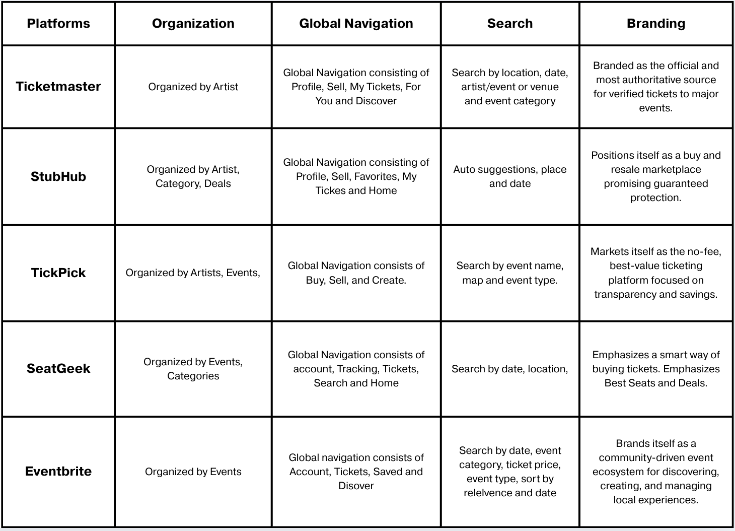
Insights from Competitive Analysis
Search bar at the top of the interface with relevant filters such as location, category, Price, date, and map
Content organized by event, artist, category, and deal
Global navigation at the bottom with high-priority tasks
Potential to be branded as a platform that makes it “easy” to find and post local events
User classes
Two user classes were identified:
Attendees
Organizers

Interview
We conducted 12 interviews with potential users of this app:
6 attendees
6 organizers

Results
Attendee pain points:
Must follow the “right” accounts; smaller events are hard to find.
Newcomers often struggle to meet cultural/linguistic/accessibility needs initially.
Abandon platforms that feel stale or duplicative (e.g., outdated listings).
Organizer pain points:
Algorithmic reach is inconsistent; followers don’t always see posts.
Absence of seamless photo/media upload; Need for simple, clean UI.
Re-posting to multiple social media platforms.
Attendee User Persona
Maya is a 26-year-old UT Austin grad student juggling classes, work, and social life who is budget-conscious
Goals: Find affordable, relevant events quickly, avoid FOMO, and lock in plans without overthinking.
Behaviors: Uses This Weekend and price filters, compares 2–3 options, shares links in group chats.
Pain points: Hidden fees, outdated listings, unclear parking/transit info, and missing accessibility details.
Needs: Transparent pricing, clear logistics and accessibility signals, personalized recommendations, and one-tap buy.

Organizer User Persona
Riley is a 29-year-old, Austin-based jazz musician booking 4–6 small-venue and pop-up shows per month; self-manages promotion.
Goals: Fill rooms, grow a local following, reduce no-shows, and turn attendees into repeat fans.
Behaviors: Cross-posts to social media and monitors basic turnout metrics.
Pain points: Re-entering event info across platforms, weak promo targeting, unclear venue logistics, fans missing updates, and limited insight into what drove attendance.
Needs: Fast event creation, targeted promotion tools.

Information Architecture & Interaction Design Rationale
Findability
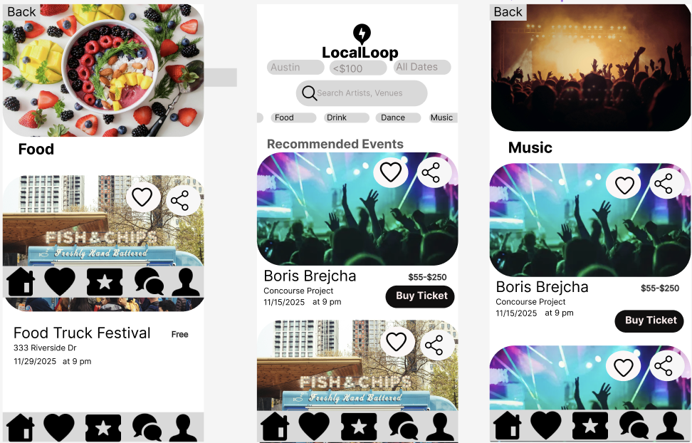
The home screen uses a filter-focused search function, surfacing high-priority facets—location, price, date, artist/venue, and event category—within the hero area. This enables users to narrow the event set immediately and reflects the app’s positioning around fast discovery. Search and filters are accessible with one tap, reinforcing filters as a primary differentiating feature of LocalLoop as a filter-centric event discovery system.
Visual Hierarchy
A clear visual hierarchy guides user attention from expressive event imagery (primary attention anchor) to critical metadata such as location, date, and time (secondary informational cues). This hierarchy supports rapid scanning and comparison, allowing users to assess relevance before engaging with deeper interaction.
Thumb-Zone Optimization & Fitts’s Law
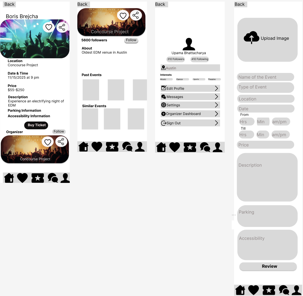
Frequently used controls—including the global navigation bar and primary call-to-action (e.g., “Buy Ticket”)—are placed within the natural thumb zone on mobile. This reduces interaction cost and aligns with Fitts’s Law, improving reachability and minimizing effort during one-handed use.
Navigation Structure
A bottom global navigation bar provides direct access to core sections of the app (Home, Favorites, Tickets, Chat, Profile). This supports recognition over recall, improves wayfinding, and allows users to move between high-value tasks without retracing steps or navigating deep hierarchies.
Labeling
Labels use plain-language, domain-familiar terminology, reducing cognitive load and ambiguity. Call-to-action buttons employ single, action-oriented verbs to clarify intent.
Organization
The app is organized by task. It enables tasks like searching with different filters, viewing your profile, viewing your chat messages, viewing tickets, viewing favorite events, organizer
Thoughtfully crafted to elevate what matters most.
Information Architecture & Interaction Design Rationale
Task-oriented Information Architecture (IA)
The interface organizes content around primary user tasks—discover, evaluate, act, and manage—with event details, organizer context, profile management, and event creation clearly separated but cross-linked. This supports efficient wayfinding while preserving a coherent mental model across attendee and organizer flows.Progressive Disclosure to Reduce Cognitive Load
Decision-critical information (date, time, location, price, primary CTA) is surfaced first on event pages, while secondary details (parking, accessibility, organizer history) are revealed later. This follows progressive disclosure principles, allowing users to commit quickly without sacrificing access to essential context.Gestalt Principles for Visual Grouping and Scanability
Proximity, similarity, and enclosure are used to group related information (e.g., event metadata blocks, form fields, organizer cards), enabling users to parse content rapidly. Consistent card structures and alignment reinforce visual relationships and improve scannability.Affordance-Driven Interaction and Reachability
Primary actions (Buy Ticket, Follow, Save, Share, Review) are visually distinct and placed within the thumb zone, aligning with Fitts’s Law and mobile ergonomics. Clear affordances communicate possible actions at each step, supporting confident, low-effort interaction.
What I learnt
Designing for two user classes requires distinct mental models for each user class: separating attendee and organizer needs early (via user classes, personas, and interviews) helped prevent one flow from dominating the product.
Findability : making search + filters the primary interaction model (facet-forward, one-tap access) directly addressed discovery pain points like “must follow the right accounts” and “stale/outdated listings.”
Task-oriented IA improves wayfinding and reduces friction: organizing the app around core tasks (discover, evaluate, act, manage) and using bottom global navigation supported recognition over recall and kept high-priority actions accessible.
Progressive disclosure helps users commit without losing essential context: surfacing decision-critical details first (date, time, location, price, CTA) and layering secondary details later reduced cognitive load while preserving depth.
Micro-interaction design matters on mobile: thumb-zone placement and clear affordances (guided by Fitts’s Law) lowered interaction cost for frequent actions like buying tickets, saving, sharing, and navigating.